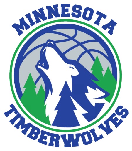
In a surprising turn of events, the Minnesota Timberwolves have announced a logo change. Normally major changes to team properties, such as logo adjustments need to be made months in advance before the start of the season. However, the Timberwolves were apparently able to make these changes suddenly and quietly, due to the fact that this logo update falls under the guidelines of a “color change” vs. an outright logo change. It has also been reported that the Wolves will be returning to their original jerseys that they wore from 1989-90 to 1994-95. Again, the fact that the Wolves are not introducing anything “new” has allowed them to make these changes on such short notice.
The initial plans for this season were to incorporate a slight alteration to the team’s current jersey, which was initially released for the start of the 2008-09 season. However, the overall perception among fans regarding Minnesota’s recent jersey and logo alterations has been less than ecstatic. In an attempt to show that they are listening to the fans and making strides to change the direction of the team, Wolves leadership worked quickly and quietly to secure permission from the league for the late-breaking logo and jersey change. The finished logo products are below. Images of the new jerseys have not been released, but by all accounts they will look identical to the team’s original jersey, except for updated logos on the shorts.


