Anything Wolves related today obviously revolves around the new jerseys in this photograph (photograph from Timberwolves.com). For those Wolves fans emerging from the cave, the team unveiled the new, thid incarnation of the Timberwolves jerseys. I have had three seperate reactions to this jersey.
The first reaction came in late July/early August with the picture of Kevin Love in what was being touted on many blogs as possibly being the new Wolves jersey. I had a bifurcated first reaction as (a) the jersey looked like a practice jersey, so I didn’t think it was worth getting up in arms about, but (b) the part of me reacting to a new jersey immediately hated it.
My second reaction came this morning when CW "unvelied" the new uniform after a conference call with several Wolves VIPs and media/media-related personalities. Besides liking Miller’s shoes, my reaction was entirely negative.
Finally, my third reaction came just after noon in the Crystal Court of the IDS Center at the official unveiling. Upon survivng the small talk between Tom Hanneman and Fred Hoiberg, and then zoning out team president Chris Wright’s inaudible oration (sorry Mr. Wright, the acoustics in the Crystal Court certainly don’t allow a speaker to sound crystal clear…that and I wanted to use my lunch hour to do things like eat lunch and check out Target gals), the Wolves Kevin-Love-look-a-like employee flipped the on switch to the air pumps and two large, inflatable jerseys signaled the next era of Wolves fashion. I ran into CW at the unveiling, and I summed up my thoughts as, "I liked the previous home jerseys better, and the new road jerseys better."
So there you have it, that was then (two hours ago), and is now, my simple reaction to these uniforms. However, seeing that I didn’t like our last uniforms, that doesn’t mean much. In all the other posts and sources I’ve read today, the front office has used phrases like, "refresh our brand," and "new era." The new uniforms look like the 2nd generation uniform’s colors went on summer break in Charlotte and mated with the design of the Bobcats uniforms (and must have been very drunk to do so).
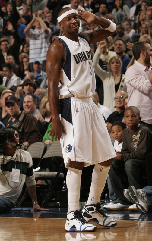
I do have a more "old school" taste, but this is not only aesthetic (as I believe the jersey below is the best jersey in Wolves history), it is also historic. If you can’t tell, the image below comes from Online Sports.com

Please click "Read More" to hear my detailed likes (yes, there are some) and dislikes of this jersey and a historical view of why we won’t be throwing parades in the Twin Cities with this jersey.
On the New Jerseys:
I hate that we kept the colors. From a marketing standpoint, I personally do not believe that this jersey is going to be the next big thing all the cool kids are wearing. Those in Kobe, T-Mac, Wade, KG and LeBron’s camps need not worry about the 300 million basketball players in China suddenly swarming to this jersey. If the team’s intent is to "refresh the brand," then the front office better hope the players perform well to transform the team into winners from losers because these colors and designs are substantially similar to the last generation.
I do like the new lettering font, but I’m largely disappointed that the number font is basically identical. Talking to CW, he said the designers have addressed the problem with the "8". For CW’s sake (and his Gomes jersey’s sake) I hope he’s right. Here is a link to the June 9, 2008 Straight Cash Homey dot Net post where my buddy and I were photographed in Florida. As you can see (and read in the comments), the number 8 looks upside-down. It’s almost as if the designer was putting the finishing touches on when his two-year old kid flipped the 8 around. While this may pass muster on a proud parent’s refrigerator, it doesn’t fly in the NBA store. I already hated the tree lines on the last jersey, and I think the sides on this jersey are too loud.
So, from an aesthetic view, I don’t like the uniforms in general. I think the new road jersey is better, but the home jersey is worse.
Second, from a business standpoint and generating sales, I think they’ve dropped the ball big time. I guess time will tell.
As far as the logos, make no mistake: The Old Logo was inspired by the original Timberwolves logo, not the now second generation logo, and certainly not the new secondary logo that looks like Mary Grandpre (the lady that does the chapter drawings in Harry Potter books) was tasked with the creation.
The Jersey History of Winning NBA Basketball:
Given a white piece of paper and a minimum amount of artistic ability, any person would be able to piece together a substantially accurate color drawing of every NBA champion from the year I was born (1980…and this probably applies to the beginning of the NBA), to the present if armed with the following: 
The only color needed to make a slight "tweak" is the gray marker in place of the Spurs’ silver. Other than that, classic colors make for classy uniforms and classic teams. The Wolves used to have it.
In general, the less jazz on a uniform the better. Save the pastels for Easter and Don Johnson. I will not be buying a new Wolves jersey.
Did I miss where the new, secondary logos are on this jersey? Someone please fill me in.
